As you know, the first video was not that satisfying. So, my leader decided tore-do the whole video. This time, I was given the part to trace a flower. It took me a long time to trace it. But I was satisfied with what I have done.
There are only a few steps to trace the flower. But I would like to show how the flower turned out to look like...
I like how theflower turns out. Again there are a lot of work and time needed to do this flower. So, here are a few steps that you can learn how to trace the flower.
Step 1:
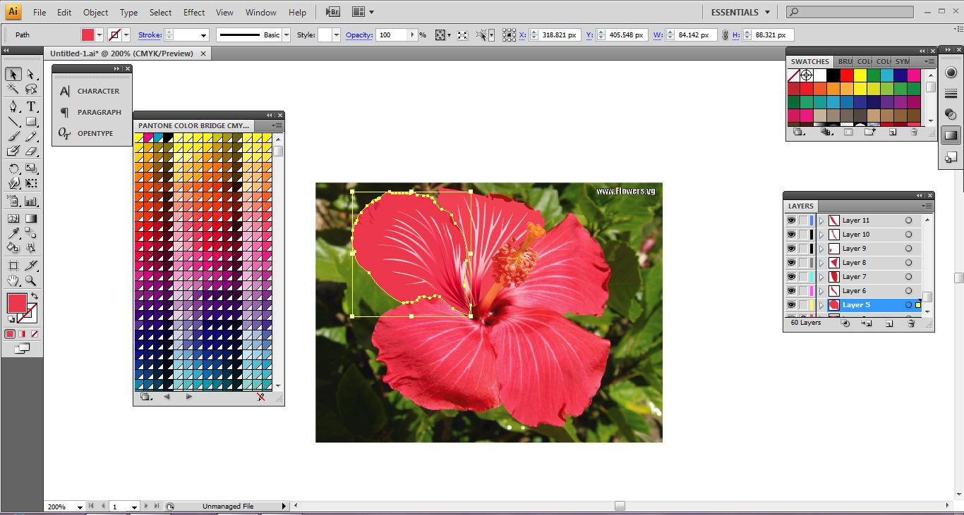
Firstly, I trace the first petal using the pen tool and change the stroke to none. After that, I used the eyedropper tool to fill up colours to the selected petal. I even draw the already formed lines on the flower and colour it using the gradient tool and the Pantone Color Bridge CMYK EC to choose the almost exact colour for the petal lines. For the dark part of the petal, I used pen tool to trace and eyedropper tool to fill it up with colour.
Step 2:
From here you can see a bit more better on how the petal was coloured.
Note: To get the Pantone Color Bridge CMYK EC, go to swatch option to open the Open Swatch Library, then go to color books and there you can have the option on choosing the Pantone Color Bridge CMYK EC
Step 3:
The final step is to trace the stigma, pollen sacs and pistil. For both the stigma and pollen sacs, I used the eclipse tool to trace them. I used light orange and orange colour for the stigma while I used the red and dark pink colours for the pollen sacs. Most of the colours I used are from the Pantone Color Bridge CMYK EC because of the tonal and different kinds of colour that I can choose.
Overall, there are 62 layers in creating this flower.
This time it's part 2 of the making of the video. My leader had already chosen a title which is "Revolution". So, I will show you part by part of how I do Tun Dr. Mahathir's speech. The background that my leader want us to use is the old style newspaper which is...
Thisis the background that I chose for Tun Dr. Mahathir's speech.
Below are the pictures and the descriptions of how I do the video.
1) For picture one, shows the background of the video. Then, for the second picture, the video and the word 'Negara Maju' appeared to show that the audio had been set in. For the thirdpictureanotheralsoappear to be matched with the audio.
2) Starting from the picture number four to the picture number eight, I mostly use motion tween to move my words. By just changing the the position and the size of the words, I can make the words move with just marking up to the preferred frame and changing the properties of the words to alpha (if I want to make the preferred word to disappear).
Last but not least, my leader wanted us to include the name of the Prime Minister and the date of their service for the country. So, this is what I did...
Note: subject may change according to my leader's preference.
As you know, I did mentioned that I'll be doing a short video with my group. My group leader had chosen patriotic speeches by our Malaysian past to present Prime Minister. Each of us were given our part to do the video. I was given the part to do the video on our fourth Prime Minister, Tun Dr. Mahathir Mohamad. So, again I will be showing step-by-step on how I work on my part that I'm responsible for...
The program that is needed to make this video: Adobe Illustrator/ Photoshop and Flash professional CS4/CS5.
I'm more to an illustrator person than a photoshop person. So, most of my works are done using illustrator. From the picture that I'm about to show you, you'll know that our video is a simple one.
Below is how I do my part, that is the speech of Tun Dr. Mahathir Mohamad.
1. I first type out the speech with my chosen font that is Aparajita. The colours that I used are simple. That is black and red. The font size is 36. Not to make it too big or too small to fit the words in.
2. I retyped those words again by opening every new file. 3. And for all those words, what I did was to open a different layer for every words and type them one-by-one. 4. After that, I'll make one by one of those words disappeared by clicking the 'eye' on the layer setting and export them into PNG file.
This week, we are require to do a kinetic typography assignment. This time, we were split into a group of five. My group leader decided to do a combination of speeches from the first Prime Minister to the sixth Prime Minister of Malaysia. We collect different kinds of video and combine the audio to make it a 3 minute video. That was the maximum time that we are given by the lecturer. These are the videos (there are videos that are just ideas where we can do in our kinetic typography) that we do research on.
First up are the videos on ideas where we generate our ideas from.
1. A short animation on kinetic typography.
2. A nice video on different people talking. This is where we get the idea of using an old treasure map styled paper to be put as the background.
3. A video about us not to be racist. No offend to anyone though.
Next are the videos on patriotism speeches (again some of the videos are not speech but biography about the past Prime Ministers of Malaysia)...
This is about our second Prime Minister of Malaysia.
A song with lyrics on screen about 'Malaysia Boleh'.
This is one of the main video that we were looking for, especially the part where Tunku Abdul Razak was having his speech up to the part where he shouted "Merdeka, merdeka, merdeka...". We only took the part where he said 'merdeka' for three times only.
This is also another video we took to put it in our kinetic typography. We even took the part where Tun Dr. Mahathir was having his speech.
There are some other research we found that maybe could be useful for our research.
There are even some other research that we find quite interesting...
Those are researches that we found. It might not be necessary for us to put all that into our own video.
I had a lot to change on my previous draft that I decide to do something simple. As I know, my lecturer allow us to do something cute and simple (since I had saw what my friend did before). I think it would do something like that. Since I'm now studying in a higher level of education. Things aren't going to be as easy as it sound. Besides, my third semester is a short semester. So, I have a lot of things to do for this semester. Being fatigue is the first thing that happens to me. So, now this is my final work...
TADAA...!! My poster is finally done! I hope it's not that childish. There are steps here in doing this poster. All you need is an adobe illustrator program.
Step 1-
Use the rectangle tool to open up an A4 sized background. Since the colour of unity in the Malaysia flag is blue, so, I used blue colour to as the background colour. To make a gradient colour on the blue colour, open the gradient on the right side. There, it will show a gradient colour meter adjustment. Open the colour books by clicking the option on the swatch. After that, open a new layer and drag in the chosen image.
Step 2-
For the three main races in Malaysia, as usual, I'll open every layer for their head, body (with their clothes on) and shadows in different layers. I chose the colour for their skin tone and also the colour of their clothes. I trace their shadows and just change the opacity to make it look lighter. Note : - for the colours, I use the colour books from the swatch option.
Step 3-
The final part is the typography. I used the Vinate BT font. By doing that, I change the colours of the font.
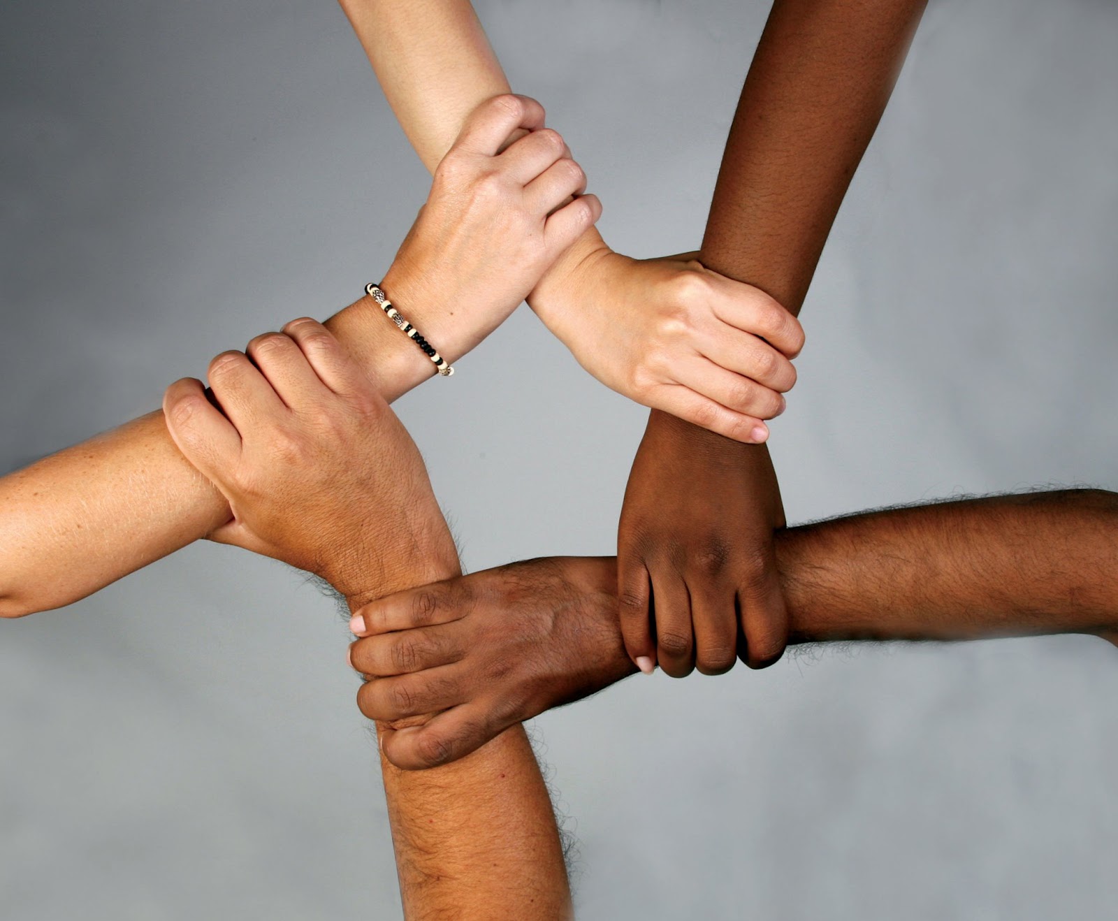
These pictures above is what I used to draft out my first poster, but it didn't come out the way I wanted. So, I need to change to another one. My idea is mainly on the unity of different culture. My idea is actually to show different skin colour people holding hands sa you can see from the above. This is to show that we can support each other through every circumstance. Besides that, the picture below show children of different culture and races being together. To me, patriotism is us being together in a multiracial country. Besides, the colour blue is the colour of unity in the Malaysia flag.